◯ Good Packaging Design
Click thumbnails to view larger images

I like this packing design because:
1) you can touch the ball directory
2) it mentions new functions and main features clearly
3) the color contrast between the ball and the box, black and red.
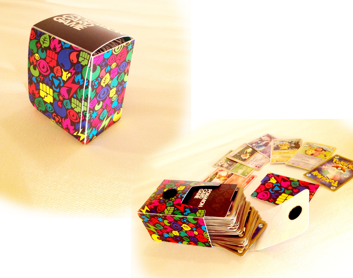
Pokemon Trading Card Game
I like this packing design because:
1) illustrations on the box shows pokemon's characters that can be organized according to a number of different attributes such as fire, water, or thunder type, etc.
2) cheerful vivid color is fun
3) Velcro (magic tape) is stable to keep.

Fat Loss Monitor
I like this packing design because:
1) clear window can be seen the product.
2) box's colors are fitted to buttons and the body of machine.
3) clearly mentions what the main features of this product are.
× Bad Packaging Design

GLAD Cling Wrap
I dislike this packing design because:
1) I didn't realize it's a red wrap inside!! should be described it.
2) the packaging color does not look healthy and natural, gaudy-coloered packaging.
2) the packaging color does not look healthy and natural, gaudy-coloered packaging.

C&H Sugar
I dislike this packing design because:
1) sugar often spills out from the side
2) hard to stand itself
3) weakness against water
Singer Sawing Machine
I dislike this packing design because:
1) can't organize a pedal switch and its code with this baggy packaging
2) not beautiful at all
understand for packaging design throughout my research:
Color, shape, easy to understand description, and functionally!

I like the Pokemon card holder ^^
ReplyDelete>lasrsong007
ReplyDeleteThank you!! I love it, too..
Thank You and I have a neat supply: Can You Hire Someone To Renovate A House victorian renovation
ReplyDelete