◯ Good Packaging Design
Click thumbnails to view larger images

I like this packing design because:
1) you can touch the ball directory
2) it mentions new functions and main features clearly
3) the color contrast between the ball and the box, black and red.
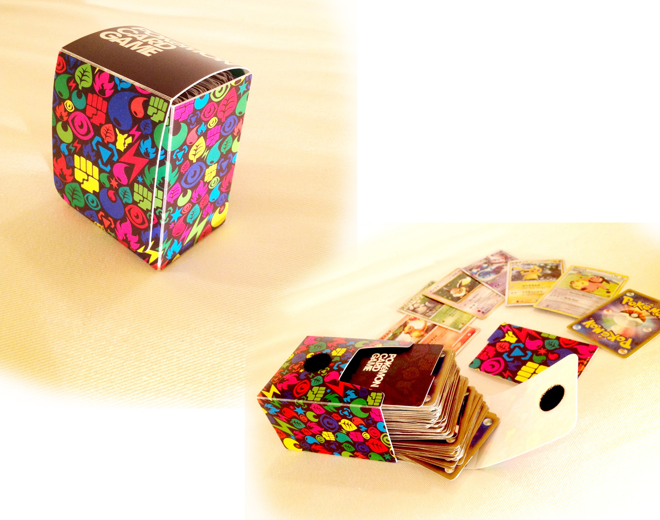
Pokemon Trading Card Game
I like this packing design because:
1) illustrations on the box shows pokemon's characters that can be organized according to a number of different attributes such as fire, water, or thunder type, etc.
2) cheerful vivid color is fun
3) Velcro (magic tape) is stable to keep.

Fat Loss Monitor
I like this packing design because:
1) clear window can be seen the product.
2) box's colors are fitted to buttons and the body of machine.
3) clearly mentions what the main features of this product are.