10.23.2012
9.26.2012
Objectified -from one of different cultural eyes-
I watched “objectified” at Amazon. Every
design has stories. Design should be innovative, make a product useful,
aesthetic design, long-lived, and environmentally friendly. One Japanese
designer appeared in the movie. Naoto Fukazawa who is a designer for a Japanese
retail company which sells wide variety of household and consumer goods, Muji.
I am a little worried about weather other
countries people can understand what he wanted to tell, because his talking
about designs strongly takes a peculiar Japanese way and cultural elements. Haiku
influenced Naoto Fukazawa’s design a lot. Haiku is
a fixed verse form of seventeen syllables arranged in a five-seven-five
pattern. One of the characteristics of Haiku is its artistic brevity. Haiku
gives an objective, fleeting picture of its subject in simple words. Japanese
like simple, frugal, and calm. We like quickly sensing beauty what does it
means by an object or a visual scene just in front of you.
Why I realized this thing? Because,
Aquarina’s plastic bottle looked same as a Japanese water brand, ILOHAS.
Recently, I am feeling American people also start to get an interest in sustainability
these days. Recycling, environmentally friendly, and
sustainability are long-lived interests for Japanese because of our small
country.
ILOHAS became the number one brand in
water brands only in 6 months in Japan in 2009. Ecology has becoming
"growing concern" in Japan where people are getting sensitive to
ecological matters such as "waste" and "CO2 emission" day
by day. The ILOHAS ad has gotten into the Japanese consumers’ growing desire to
contribute to solving environmental problems through convincing them that they
would make a meaningful contribution to the natural environment. The ILOHAS’
new created pet package which is described as “40% reduction in the PET package
weight, we made the smallest label we could, we planned sources of the water
from a places close to the plant to further reduce CO2 emission from
transport.” The
second ad shows ILOHAS’ ultra-light crushable plastic pet bottle and it
shows that a consumer can crush the lightest and softest plastic pet bottle by
her or himself. The ad shows how it is easier to crush the pet bottles than
other plastic bottles. “Aquafina” is almost same. They succeed 50% less plastic
on the bottle.
I can conclude that the ILOHAS and
Aquafina makes use of the emotion of consumer’s desire to involve environmental
friendly. Those products allude that if a consumer buys this new packaging water, he or
she will take part in the environmental action.
9.18.2012
LOGOs for Project #1
--------------------------------------------------------------------------------------------------------------------------


Sample for a packaging design of rosemary.
I will change the brand name of O organics to "Organics me" or just "Organics".
9.06.2012
Mood Board #1
O Organics Mood Board By ASKA
O ORGANICS: Quality and great taste the way nature intended!
The O ORGANICS I am going to redesign is great tasting organic foods, beverages, and ingredients should be available to everyone and sold everywhere at a great value.
The Three Structures are:
1)Jar 2)Carton 3)sack or can (not decided yet)
1)Jar 2)Carton 3)sack or can (not decided yet)
The products that I will be working with are:
1)Herbs and seasonings 2)Tea bags 3)coffee beans
1)Herbs and seasonings 2)Tea bags 3)coffee beans
My goals for the new packing designs:
- rename the brand name
- rename the brand name
- using a drawing of leaf or a vegetable as a part of the new logo
- using more natural color (maybe fade colors...?)
- changing font face
Tea leaves - Green tea, Green tea with lemon, Green tea with peach
Tea leaves - Green tea, Green tea with lemon, Green tea with peach
8.30.2012
Good and Bad Packaging Design
◯ Good Packaging Design
Click thumbnails to view larger images
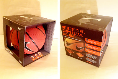
NikeBasket Ball
I like this packing design because:
1) you can touch the ball directory
2) it mentions new functions and main features clearly
3) the color contrast between the ball and the box, black and red.

Pokemon Trading Card Game
I like this packing design because:
1) illustrations on the box shows pokemon's characters that can be organized according to a number of different attributes such as fire, water, or thunder type, etc.
2) cheerful vivid color is fun
3) Velcro (magic tape) is stable to keep.
Fat Loss Monitor
I like this packing design because:
1) clear window can be seen the product.
2) box's colors are fitted to buttons and the body of machine.
3) clearly mentions what the main features of this product are.
Subscribe to:
Posts (Atom)


